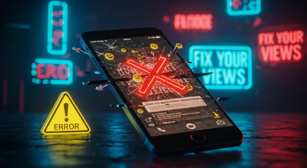
If you’re new to YouTube, you’ve probably heard the golden rule: thumbnails and titles are everything. They’re your video’s first impression, the digital bait that either hooks viewers or lets them swim away. But here’s the thing—getting them right is harder than it looks. As a beginner, it’s easy to make mistakes that tank your click-through rate (CTR) and leave your videos languishing with single-digit views. Don’t worry, though—I’ve been there, and I’m here to help. Let’s walk through the most common YouTube thumbnail and title mistakes beginners make, and more importantly, how to fix them. By the end of this guide, you’ll have a clear roadmap to create thumbnails and titles that actually get clicks.
Mistake #1: Using Blurry or Low-Quality Thumbnails
Let’s start with thumbnails, since they’re the first thing viewers see. One of the biggest mistakes I see new creators make is uploading blurry or low-quality images. Maybe you took a screenshot from your video, but it’s pixelated. Or perhaps you used a photo that looked fine on your phone but turned into a blurry mess on YouTube. A low-quality thumbnail screams “amateur,” and viewers will scroll right past it.
- Why It Hurts: YouTube is a visual platform, and clarity matters. A 2023 study by VidIQ found that thumbnails with sharp, high-resolution images had a 25% higher CTR than blurry ones. If your thumbnail looks like it was taken with a potato, viewers will assume your video quality is just as bad.
- How to Fix It: Always use high-resolution images—at least 1280×720 pixels, which is YouTube’s recommended thumbnail size. If you’re taking a custom photo, use good lighting and a decent camera (your smartphone works fine if you’ve got steady hands). If you’re pulling a frame from your video, export it in the highest quality possible. Tools like Canva or Photoshop can help you sharpen up your image and add a professional touch.
Mistake #2: Writing Clickbait Titles That Don’t Deliver
Titles are your second chance to grab attention, but a lot of beginners fall into the clickbait trap. You know the type: “I QUIT YOUTUBE FOREVER!” only for the video to be about taking a week-long break. Or “INSANE HACK YOU NEED TO KNOW!” when the hack is something basic like “use hashtags.” Clickbait might get you a few clicks, but it’ll hurt you in the long run.
- Why It Hurts: When viewers feel misled, they’ll click away fast, which tanks your watch time—a key metric YouTube uses to rank videos. According to YouTube’s Creator Academy in 2024, videos with high bounce rates (viewers leaving within the first 30 seconds) are less likely to be recommended. Plus, you’ll lose trust with your audience.
- How to Fix It: Be honest but intriguing. Instead of “I QUIT YOUTUBE FOREVER!” try “Why I Almost Quit YouTube (And What I Learned).” It still sparks curiosity but sets accurate expectations. A good rule of thumb: if your title promises something, make sure your video delivers. If you’re teaching a hack, make it genuinely useful—like “The Thumbnail Trick That Doubled My Views.”
Mistake #3: Overcrowding Your Thumbnail with Text or Elements
I get it—you want your thumbnail to say everything. So you slap on a bunch of text, arrows, emojis, and maybe a random starburst for good measure. But here’s the problem: a cluttered thumbnail is hard to read, especially on mobile, where 70% of YouTube views happen (per YouTube’s 2024 Creator Report). If viewers can’t process your thumbnail in a split second, they’ll keep scrolling.
- Why It Hurts: A cluttered thumbnail confuses the eye and dilutes your message. A 2022 Backlinko study found that thumbnails with minimal text (2-3 words) and a clear focal point had a 15% higher CTR than busy ones.
- How to Fix It: Simplify. Choose one focal point—like your face, a key object, or a bold color—and build around it. If you’re adding text, keep it to 2-3 words, use a bold font like Impact, and add a drop shadow to make it pop. For example, a thumbnail with just your face and the word “FAIL!” in big letters is way more effective than one crammed with “MY BIGGEST FAIL EVER WATCH NOW!!!” Test your thumbnail by zooming out—can you still tell what’s going on? If not, strip it down.
Mistake #4: Writing Titles That Are Too Long or Vague
On the title side, a common mistake is writing titles that are either too long or too vague. A title like “Here’s What I Did to Make a Thumbnail and How It Went for Me on YouTube” is way too wordy, and something like “My New Video” tells viewers nothing. Both are a missed opportunity to hook your audience.
- Why It Hurts: YouTube cuts off titles after about 60 characters in search results, so long titles get truncated. Vague titles, meanwhile, don’t give viewers a reason to click. A 2023 HubSpot study showed that specific, concise titles (e.g., “5 Thumbnail Tips for Beginners”) outperformed vague ones by 40% in CTR.
- How to Fix It: Keep your title under 60 characters and make it specific. Instead of “My New Video,” try “I Fixed My Thumbnail and Got 10K Views!” It’s short, specific, and intriguing. Use numbers, questions, or power words like “ultimate” or “secret” to add punch. For example, “Are Your Thumbnails Hurting Your Views?” is better than “Thumbnails and Views.”
Mistake #5: Choosing Colors That Blend into YouTube’s Interface
Thumbnails need to stand out, but a lot of beginners pick colors that blend into YouTube’s white and gray interface. If your thumbnail is mostly white or light gray, it’ll disappear into the background of a search page or recommended videos sidebar.
- Why It Hurts: YouTube is a crowded space, and your thumbnail needs to pop visually. A 2021 VidIQ analysis found that thumbnails with high-contrast colors (like red, yellow, or blue against a dark background) had a 20% higher CTR than those with low-contrast colors.
- How to Fix It: Use bold, contrasting colors. If your thumbnail has a light subject (like a person in a white shirt), put them against a dark background, like navy blue or black. If your subject is dark, use a bright background like red or yellow. Test your thumbnail against a white background to see if it stands out. Creators like Emma Chamberlain often use vibrant colors like hot pink or lime green to make their thumbnails pop—take a page from their book.
How to Check Your Work (No Tools Needed)
You don’t need a fancy “youtube thumbnail tester” to spot these mistakes. After creating your thumbnail and title, step back and ask: Does my thumbnail pop visually? Is my title clear and intriguing? Preview your video in YouTube Studio to see how it looks in search results. If your thumbnail blends in or your title gets cut off, tweak it. You can also show your work to a friend and ask, “Would you click on this?” If they hesitate, you’ve got some fixing to do. If you want to really test your thumbnail and title, try Check My Thumbnail for free.
Learn from Your Mistakes
The best way to avoid these mistakes long-term is to learn from your data. Once your video is live, check your CTR in YouTube Analytics. If it’s below 5% (a decent benchmark for beginners, per YouTube’s 2024 Creator Academy), experiment with a new thumbnail or title. YouTube lets you update both without affecting your video’s stats, so don’t be afraid to iterate. Over time, you’ll get a feel for what works for your audience—and your views will start to climb.
Final Thoughts
As a beginner, it’s easy to make these YouTube thumbnail and title mistakes, but they’re just as easy to fix once you know what to look for. Focus on clarity, simplicity, and contrast for your thumbnails, and keep your titles honest, concise, and curiosity-driven. Avoid the pitfalls of blurry images, clickbait, and cluttered designs, and you’ll be well on your way to creating videos that viewers can’t resist clicking. So, go back to your latest video, take a hard look at your thumbnail and title, and ask yourself: Are they helping or hurting my views? A few small tweaks could make all the difference.