Have you ever wondered why you click one video and scroll past another?
It’s not random—and it’s not always the best video that wins. In most cases, it’s the thumbnail that makes the first move.
This article explores YouTube thumbnail psychology: how our brains react to images, color, faces, and emotion—and how you can use that to design thumbnails that actually convert.
Why Thumbnail Psychology Matters More Than Ever
In 2025, most views come from YouTube’s homepage and suggested feed—not from search.
That means your thumbnail isn’t just decoration—it’s your first impression, your billboard, and your pitch, all rolled into one.
Understanding how viewers subconsciously react to images helps you:
- Boost click-through rates (CTR)
- Build visual consistency
- Earn trust in the feed
Let’s break down what makes a thumbnail “clickable” from a psychological point of view.
1. Faces Trigger Instant Emotion
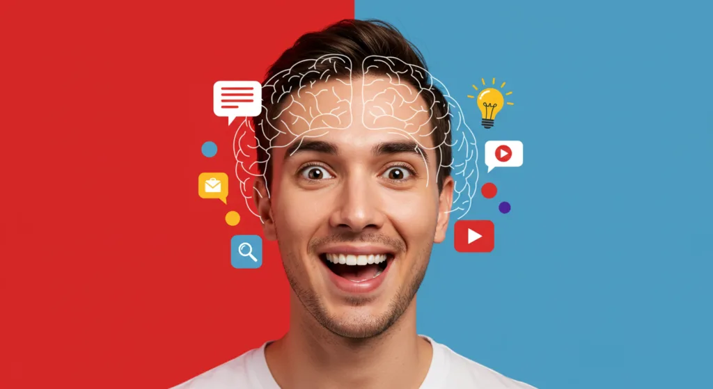
Humans are hardwired to respond to faces. In fact, our brains process facial expressions faster than text.
Why this matters:
A thumbnail with a face—especially one showing strong emotion—grabs attention fast.
What to do:
- Zoom in on the face
- Show surprise, fear, joy, or confusion
- Angle the face slightly for depth and drama
No emotion = no urgency to click.
For examples of how this goes wrong, check out 5 Thumbnail Mistakes That Cost You Clicks.
2. High Contrast Creates Scroll-Stopping Power
Low-contrast designs blend into the YouTube feed. High-contrast colors pop—even at a small size.
What works:
- Bright backgrounds with dark text (or vice versa)
- Saturated colors (reds, yellows, blues)
- Clean separation between foreground and background
👉 Want a quick fix? Here’s how to fix a bad YouTube thumbnail in 10 minutes.
3. Curiosity Gaps Trigger the Brain’s “Open Loop”
The most powerful thumbnails (and titles) leave viewers with a question:
- “Wait—what happened?”
- “Why does that look so intense?”
- “What am I missing?”
This mental tension is called a curiosity gap—and it’s a proven psychological hook.
What to do:
- Use text that teases, not tells (“This Almost Ruined Everything…”)
- Show a dramatic moment without explaining it fully
- Leave just enough mystery to require a click
4. Visual Metaphors Beat Literal Screenshots
Literal stills from your video rarely trigger emotion or story. But when you use a visual metaphor—something that represents the idea behind your video—you tap into association and memory.
Example:
Instead of showing a screen recording for a tech tutorial, use an image of a “melting laptop” or a confused face.
Your brain processes symbols faster than it processes detailed images. That’s why metaphor = impact.
5. Simplicity Wins Attention
Cognitive load is real. If your thumbnail has too many elements, our brain just skips it.
YouTube viewers scroll fast. Your design has to communicate instantly.
Use the “3-Element Rule”:
- 1 face
- 1 bold object or background
- 1 short piece of text (under 4 words)
Anything more, and you risk overwhelming the viewer.
Final Thoughts
The best YouTube thumbnails aren’t random. They’re built using psychological triggers that tap into human behavior.
By focusing on faces, contrast, curiosity, metaphor, and simplicity—you design thumbnails that don’t just look good.
They get clicked.
And once you master the psychology behind thumbnails, everything else becomes easier—growth, trust, and even monetization.
For a deeper dive into viewer behavior, check out YouTube’s official blog on how viewers decide what to watch.


