A workflow based on what was generated for this report.
Your single biggest CTR blocker (and what to do about it).
- Blocker: —
- Do this: —
—
—
—
Variants only appear if your report JSON provides them.
Your Title:
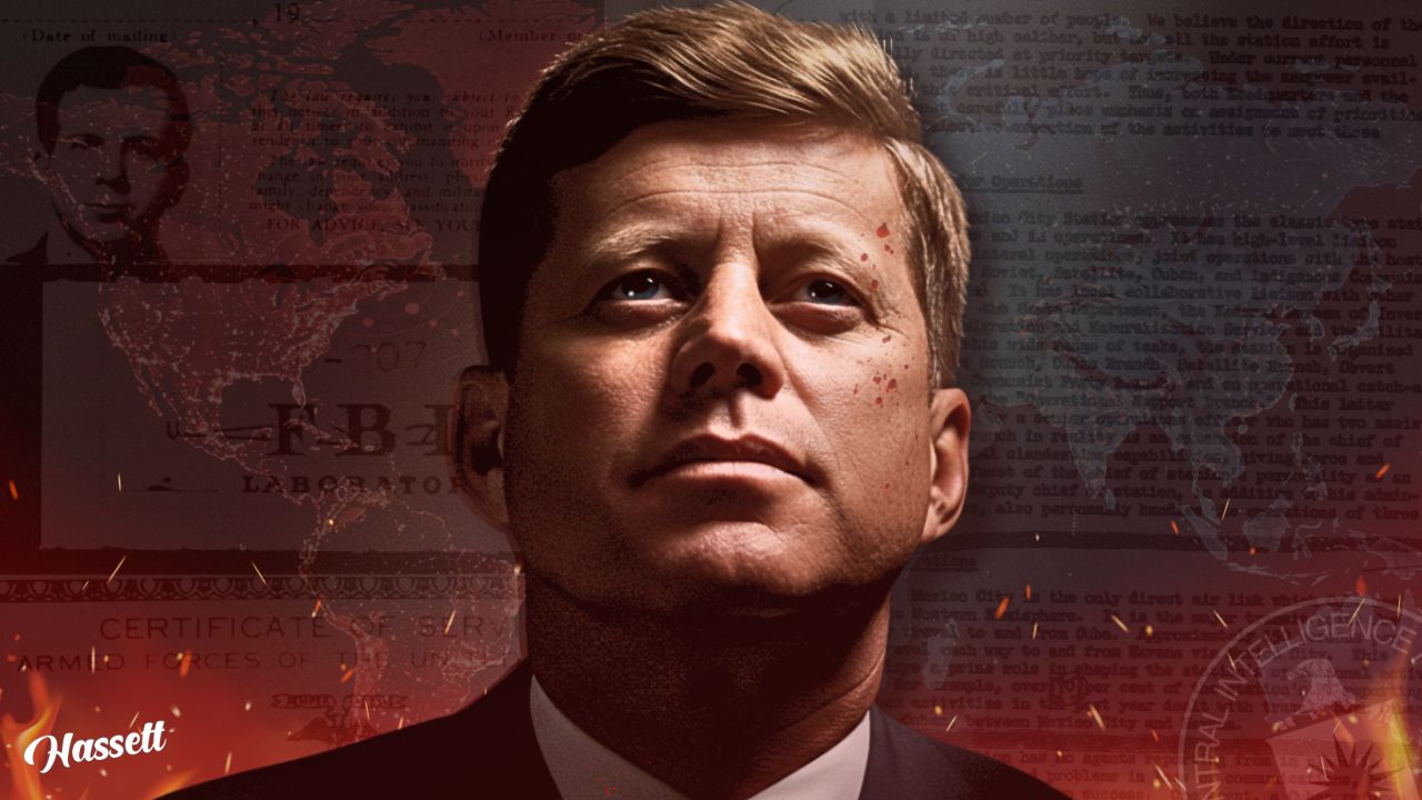
Why JFK was Really Killed
- Length: 5 words
- Scanability: Moderate; the title is straightforward but could be more impactful.
- Power words: Really, Killed
- Keywords: JFK, Killed, Why
- Numbers/Dates: —
- Case: —
- The Truth About JFK
- JFK's Assassination Explained
- What Really Happened to JFK
- Score: 60
- Insight: The title suggests a controversial topic, which aligns with the serious expression of the subject, but the lack of clear text detracts from the overall message.
- Recommendation: Use bolder, more readable fonts for the title to enhance alignment with the thumbnail's emotional tone.
How well the title and thumbnail work together (from your JSON).
- serious expression
- dramatic colors
- historical context
Detailed Thumbnail Feedback
Thirds grid, crop guide, and common YouTube overlay zones.
Avoid placing key text in the lower-right (duration chip) and lower ~12% of frame.
The design is visually striking with a dramatic color palette and a serious tone. However, the cluttered background and low text contrast reduce its effectiveness. Simplifying the design could enhance clarity and engagement.
- Style: The design is visually striking with a dramatic color palette and a serious tone. However, the cluttered background and low text contrast reduce its effectiveness. Simplifying the design could enhance clarity and engagement.
- cluttered with documents and maps, distracting
- Increase text contrast by 30%
- Simplify background elements to reduce clutter
- Brighten the subject's face by 15%
- 'Hassett' in cursive, low contrast
Readability simulations + balance metrics from your report JSON.
- Visual Center Offset: Centered on the subject's face, but background elements distract from the focal point.
- Edge Density: High due to background clutter.
- Quadrant Balance: —
Target ≥85% at 128×72 for suggested/search clarity.
Dominant colors + a visual preview (so this section never feels “empty”).
~8% of viewers have a color-vision deficiency.
Deuteranopia
Protanopia
Tritanopia
Only shows numeric ratings if your JSON provides ratios.
0% Brightness (Dark Mode)
50% Brightness
100% Brightness (Light Mode)